As any MS Word user already knows, fonts are normally used for lettering. But what are they? Essentially geometrically simple representations, defined as combinations of vectors, ie, they don't carry any notion of size. This means they are designed to be resized at no quality loss, and tend to be fairly lightweight. A picture being worth a thousand words:
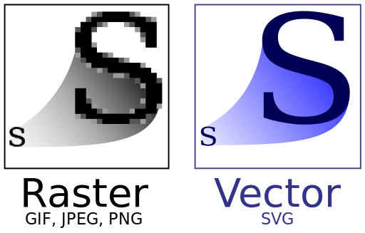 *
Great! But... why, then is this not standard on all picture formats? You can find a detailed breakdown here, but basically, vectorized images, when looked up close (no resize), tend to be too blocky / pixelated, while their rasterized counterpart are closer to picture perfect but degrade poorly when resized up; so it boils down to a balancing act between quality and file size.
*
Great! But... why, then is this not standard on all picture formats? You can find a detailed breakdown here, but basically, vectorized images, when looked up close (no resize), tend to be too blocky / pixelated, while their rasterized counterpart are closer to picture perfect but degrade poorly when resized up; so it boils down to a balancing act between quality and file size.
For all things web, size matters, especially for a visitor on a data plan! And icons, the kind of low detail mostly geometrical symbols, meant to be recognizable at a glance (just like letters), are what vectorized images were designed for in the first place. Packaging them in fonts also provides a nice added value by easing up the download / cache process (only 1 file to handle). But before looking into the gory details, what does that look like in practice? I made a canonical sample below, extracted from the very best demo I found on the web, to make it more inspection friendly (props goes to Chris Coyier, with the related post).
*
For all things web, size matters, especially for a visitor on a data plan! And icons, the kind of low detail mostly geometrical symbols, meant to be recognizable at a glance (just like letters), are what vectorized images were designed for in the first place. Packaging them in fonts also provides a nice added value by easing up the download / cache process (only 1 file to handle). But before looking into the gory details, what does that look like in practice? I made a canonical sample below, extracted from the very best demo I found on the web, to make it more inspection friendly (props goes to Chris Coyier, with the related post).
If you made it this far, you will probably be interested to know how to package your own images! As it happens, it is surprisingly easy with very little graphic design background required (full disclosure: I have none); here's a step-by-step:
- Gather a suitable image set: remember these images will be vectorized, so be aware that a rasterized image (bitmap) with excessive details may look quite bad after conversion. Also, fonts store shapes, not colors! Turn your images to black and white (no greyscale) to get a feel of the final result; in the above sample, I used an image from the excellent 700+ RPG Icons collection by Lorc, posted there in the PNG format.
- Vectorize your images: if you started out with a vector format (say SVG), you're good to go. Otherwise, check out potrace by Peter Selinger, an outstanding command-line conversion tool. In addition to outright conversion, it also allows to perform some transformations, and it lends itself nicely to batch operations; for instance, I batch converted Lorc's icons and inverted them in the process. It's worth playing with the various options for complex images to improve quality.
- Compose your font: several online tools automate this process for you, but IcoMoon stood out in the crowd, especially since it is free to use, and rights are waived for your own images. IcoMoon requires the files to be provided in SVG (supported by potrace), and produces a ready-to-use package which comprises various font formats, leveraged by a generic CSS file using them as fallbacks to ensure broad browser support, and a sample web page demonstrating usage, in the form of a dictionary for your icon font. I generated this on Lorc's collection, feel free to check it out.
Enjoy!
EDIT: this post covers some of the same ground but focuses more on the creation process, with tools such as Inkscape.
* "Bitmap VS SVG" by Yug. Licensed under Creative Commons Attribution-Share Alike 2.5 via Wikimedia Commons
No comments:
Post a Comment