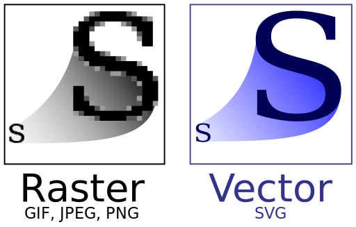
Scalable Vector Graphics (SVG) have been around for a while now. As the name suggests, it is a vector image format, ie, SVG images can be resized at no quality loss, just like fonts, and defined in plain text, in an XML format. Back in the early 2000's, it's support was very spotty, and early versions of Internet Explorer just snubbed it... so it basically was a non-starter for web development. It sailed through most of the decade, essentially unnoticed to the greater public, until the stars aligned Google put it on the spotlight.
What happened to SVG in the past decade?
EDIT: Here's another sample showing SVG in action, using its native support for animations.
This isn't to say SVG has become the hammer to hit all your web nails with. When it comes to web drawing, HTML5 specs include canvas, essentially a drawing surface which is, in most cases, hardware accelerated. But as often in new technologies, it's not an exact overlap: for one, it's raster based, ie, drawn to-the-pixel for better rendering, but not resizing friendly. It is also very primitive in that all the drawing needs to be coded (SVG images can be vased in a separate file), and it doesn't integrate to HTML the way SVG does: what's in a canvas is not, for instance available to CSS styling or DOM events (click, roll-over, etc.); in short, it can make for great performances when used right, but becomes very tedious for the most basic tasks.
So SVG got a massive usability bump, but it still hasn't gained the level of visibility enjoyed by HTML5. While it can perform very similar functions to HTML5 canvas, they are not quite redundant either. As a rule of thumb, if you are using a limited number of shapes, and a big (or scalable) drawing area, SVG is the most convenient way to go; if you are dealing with picture perfect rendering, or with hundreds of animatable images, canvas is probably the only viable option to squeeze enough performance out of your browser. Either way, many javascript libraries exist to smooth the learning curve. I haven't dug too much into canvas-based libraries, but for SVG, I'd wholeheartedly recommend you to look into Raphael.js.
What happened to SVG in the past decade?
- Increased need for scalable graphics, independent of 3rd party? The boom of Internet connected devices created a jungle of screens of all shapes and sizes, likely making a workable vector image format much more appealing. Format specifications started evolving at a steadier pace, with version 1.1 being released in 2011, and version 2 underway.
- SVG Support vastly improved, to the point it is now a perfectly fine option on all major browsers.
- Other technologies have matured, such as CSS and javascript, to the point of leveraging the XML / txt nature of SVG by integrating it seamlessly to the structure of an HTML document. SVG elements can now be manipulated like any other HTML tags, styled, used for animation or even created on the fly, while retaining its sweet scalability.
EDIT: Here's another sample showing SVG in action, using its native support for animations.
This isn't to say SVG has become the hammer to hit all your web nails with. When it comes to web drawing, HTML5 specs include canvas, essentially a drawing surface which is, in most cases, hardware accelerated. But as often in new technologies, it's not an exact overlap: for one, it's raster based, ie, drawn to-the-pixel for better rendering, but not resizing friendly. It is also very primitive in that all the drawing needs to be coded (SVG images can be vased in a separate file), and it doesn't integrate to HTML the way SVG does: what's in a canvas is not, for instance available to CSS styling or DOM events (click, roll-over, etc.); in short, it can make for great performances when used right, but becomes very tedious for the most basic tasks.
So SVG got a massive usability bump, but it still hasn't gained the level of visibility enjoyed by HTML5. While it can perform very similar functions to HTML5 canvas, they are not quite redundant either. As a rule of thumb, if you are using a limited number of shapes, and a big (or scalable) drawing area, SVG is the most convenient way to go; if you are dealing with picture perfect rendering, or with hundreds of animatable images, canvas is probably the only viable option to squeeze enough performance out of your browser. Either way, many javascript libraries exist to smooth the learning curve. I haven't dug too much into canvas-based libraries, but for SVG, I'd wholeheartedly recommend you to look into Raphael.js.